Do you believe in love at first sight? Or should I walk by again?
While browsing through the available datasets on Kaggle, I stumbled upon an interesting one - Speed Dating Experiment. Thus, this blog post is about speed dating in general, interesting analysis and insights derived from the dataset, and an answer to the question how we choose our partner.
Note: You can download a Python file containing all of the discussed analysis here.
Introduction to Speed Dating
Speed dating is a method designed around 1998 in the USA to find new flirting or relationship partners. The maximum number of participants per gender is normally limited. During the whole event every male single gets to know every female single and vice versa.
To achieve this, the event is divided into waves, each lasting about four to eight minutes. In this short time the singles have the opportunity to get to know each other and talk e.g. about common interests and hobbies. After the time has elapsed, a signal prompts the participants to change their partner. At the same time, the singles write down on their pre-delivered notes whether they would like to see their opposite again or not.
Introduction to the Dataset
The dataset was created by Ray Fisman and Sheena Iyengar, both professors at Columbia Business School, for their paper Gender Differences in Mate Selection: Evidence From a Speed Dating Experiment. It was collected in speed dating events from 2002 to 2004.
During the events, the participants had a four minute date with every other participant of the opposite sex. When the time was over, they were asked if they would like to see their date again. They were also asked to rate their opposite on six attributes, namely:
- Attractiveness
- Sincerity
- Intelligence
- Fun
- Ambition
- Shared Interests / Hobbies
Further, the dataset includes information related to demographic, lifestyle and dating habits.
Analyzing the Dataset
The dataset is available as a CSV file and can be downloaded here. It may be necessary to create an account on Kaggle and be logged in to proceed.
Having the dataset, the next step is to read the local file. Pay attention to the encoding — otherwise pd.read_csv will fail with UnicodeDecodeError or something similar.
1#!python32# -*- coding: utf-8 -*-34""" Author: nicolai92 """56import pandas as pd78fd = 'data/speed_dating_experiment/Speed Dating Data.csv'9df = pd.read_csv(fd, delimiter=',', encoding='ISO-8859-1')
Changes to the Dataset
To achieve a better readability, I make a change to the column gender. The information, whether the sex equals to male or female is encoded as 1 and 0. Hence, I replace the values by making use of an in-place algorithm.
1df.gender.replace([1, 0], ['male', 'female'], inplace=True)
Note: The statement does not yield a copy of the data frame, but applies the changes immediately.
Background on Participants
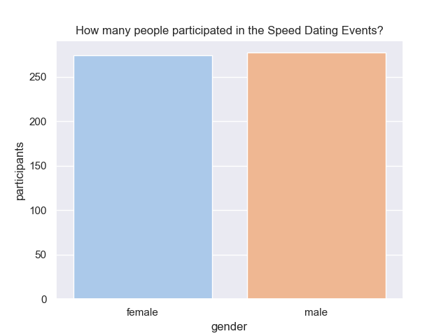
Before going into detail about how to get a second date, let’s have a look at the participants. First, I check how many unique male and female participants attended the speed dating events between the years 2002 and 2004. For this purpose, it is necessary to count the column iid and group by gender.
1cols = ['iid']2df_participants = df.groupby('gender', as_index=True)[cols].nunique()34> iid5> gender6> female 2747> male 277
The above statements yield a pandas data frame, which is shaped like shown in lines 4 to 6. Having a look at the absolute numbers, the distribution is nearly balanced. Overall, 551 men and women participated in the speed dating events. This can also be confirmed by studying the value range of the column iid - which lasts from 1 to 552.
For visualization, I make use of the library seaborn. Let’s start simple and create a bar chart with the absolute numbers of participants, grouped by gender.
1import seaborn as sns2import matplotlib.pyplot as plt # for non-interactive mode3# set global style4sns.set(style="darkgrid")56ax = sns.barplot(data=df_participants.reset_index(),7 x='gender', y='iid', palette='pastel')8# set title and labels9ax.set_title('How many people participated in the Speed Dating events?')10ax.set_ylabel('participants')11ax.set_xlabel('gender')1213plt.show(ax)
When running the script in non-interactive mode, e.g. executing from Terminal, a window should pop up and show the image below. Further, I add a title to the image as well as make changes to the labels of the axis. Finally, to prevent the window from auto-closing after a few milliseconds, matplotlib is used as a workaround in line 13.
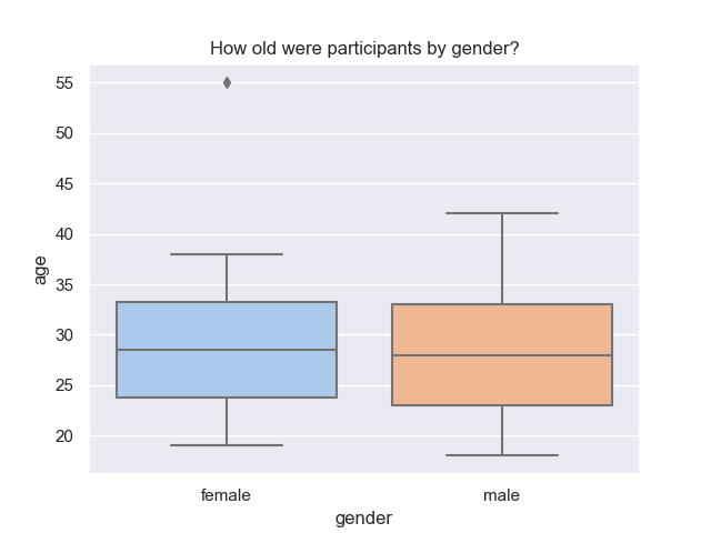
Having the information how many participants took part in the speed dating events, let’s check how old they were. Suitable for this purpose is a box plot, as it bundles five metrics (minimum, maximum, median, first quartile and third quartile) into one visualization.
First, let’s prepare a data frame by grouping by columns gender and age. Next, use seaborn for visualization — but this time plot a box plot (in line 4).
1cols = ['iid']2df_participants_age = df.groupby(['gender', 'age'], as_index=True)[cols].nunique()34bx = sns.boxplot(data=df_participants_age.reset_index(),5 x='gender', y='age', palette='pastel')6# set title and labels7bx.set_title('How old were participants by gender?')8bx.set_ylabel('age')9bx.set_xlabel('gender')1011plt.show(bx)
The bottom box plot shows the distribution of age of the participants. Interestingly, there’s a female participant aged 55 years which is deemed an outlier. Further, the plot shows a rather symmetric distribution for both genders.
Most of the male and female participants were in their early to late twenties, which is reasonable as they all were students at Columbia University’s graduate and professional schools.
Next, let’s check if there’s an attribute that is more relevant than others.
Participants’ Dating Habits
Before meeting the other attendees, the participants were asked to distribute 100 points on the six attributes mentioned earlier in this blog post. The higher the number, the more important the attribute is in a potential date. Further, total points must add up to 100.
In this paragraph all analysis follow the same pattern. Hence, I’ll explain the first analysis in detail and keep the remaining part shorter.
What are participants looking for?
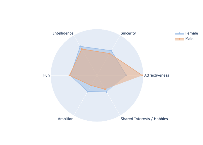
At this time, the participants just registered themselves for the event and haven’t met anyone, yet. Their first task is to distribute 100 points among six attributes and rate those higher, that are more relevant in a potential date. The question to answer is, whether there’s a difference in what men and women are looking for.
In order to create subsets for the following analysis, two filters need to be applied. First, not all columns are relevant — hence, I create a list of name cols for the columns to keep. Second, not all waves must be taken into account — thus, I create a query. Finally, I apply the filters to the data frame, group by gender and calculate a mean value for each attribute.
The resulting data frame is shaped like shown in lines 13 to 15 with gender being used as index.
1def create_analysis(cols, query) -> pd.DataFrame:2 # Filter dataframe3 analysis = df[cols][query]4 # Calculate mean value (group by gender)5 mean_df = analysis.groupby('gender', as_index=True)[cols].mean()6 return mean_df78cols = ['gender', 'attr1_1', 'sinc1_1', 'intel1_1', 'fun1_1', 'amb1_1', 'shar1_1']9query = df['wave'].between(1, 5, inclusive=True) | df['wave'].between(10, 21, inclusive=True)1011participants_looking_for = create_analysis(cols, query)1213> gender amb1_1 attr1_1 fun1_1 intel1_1 shar1_1 sinc1_114> female 12.005635 18.788883 17.043556 21.568459 12.264193 18.37708915> male 7.498773 29.108895 17.657753 19.564615 10.258607 16.233127
Next step is to plot a spider chart (or polar chart) using the recent obtained data frame. Unfortunately, seaborn does not support those kind of visualization, that’s why I make use of plotly.
For reusability, I write a function that takes in the recent data frame and an optional title to be used in the chart. Note in last code snippet, that data frame’s columns (equals to attribute names) are abbreviated — followed by two numbers, that are separated by an underscore. A regular expression (RegEx) in line 9 is used to delete the numbers as well as the underscore from column names. This is necessary for a next step to rename the abbreviations for better readability in lines 10 to 12.
At this point I can anticipate that it makes no sense to directly rename amb1_1 to Ambition, as for subsequent analysis the attached numbers to the column names differ, e.g. amb4_1 — hence, I make use of a regular expression.
1import plotly.graph_objects as go2import math3import re45def create_spider_plot(df, title: str = None) -> go.Figure:6 # Use a list of columns for labeling7 cols = list(df.columns)8 # For better readability, rename columns9 res = [re.compile(r"\d{1}[_]{1}\d{1}").sub("", m) for m in cols]10 dic = {'attr': 'Attractiveness', 'sinc': 'Sincerity', 'intel': 'Intelligence',11 'fun': 'Fun', 'amb': 'Ambition', 'shar': 'Shared Interests / Hobbies'}12 res = [dic.get(n, n) for n in res]
Having done the data preparation, it’s time to create a spider chart. Let’s start by initializing an empty go.Figure object with name fig, to which charts are added later on.
A spider chart in plotly is called go.Scatterpolar — thus, let’s add it to the existing figure. Pay attention to the comments in line 6 to 10, which explains the variables that may not be self-explanatory.
Remember, that column gender is used as data frame’s index. Consequently, the row containing the female values can be extracted by passing in the gender’s value and transforming it into a list. Next, use this list for parameter r, which refers to the values.
1# Create a Spider Chart2 fig = go.Figure()34 # Female Spider Chart5 fig.add_trace(go.Scatterpolar(6 r=df.loc['female'].values.tolist(), # Values7 theta=res, # Labels for Values8 fill='toself',9 line_color='#9CBDE6', # Use pastel colors of Seaborn lib.10 name='Female'11 ))
Let’s repeat the steps above to add another spider chart to the existing figure to include male’s values. Changes were made to parameters r, line_color and name. Hint:
1# Male Spider Chart2 fig.add_trace(go.Scatterpolar(3 r=df.loc['male'].values.tolist(), # Values4 theta=res, # Labels for Values5 fill='toself',6 line_color='#E7A77D', # Use pastel colors of Seaborn lib.7 name='Male'8 ))
Finally, let’s update the figure by adding a title. I have not set a title, as I added a caption under the figure in this blog post — but in case of sharing a visualization e.g. with a colleague, it might make sense to do so. Further, I disabled the value range in line 6, as the maximum value of each spider plot differs and it might be a bit confusing for the consumer otherwise.
In line 10, the resulting figure is returned to be further used for plotting.
1# Set Title and Value Range of Spider Chart2 fig.update_layout(3 title=title, # Use title (if not None)4 polar=dict(5 radialaxis=dict(6 visible=False # Do not show value range7 )),8 showlegend=True9 )10 return fig
Use the function for plotting a spider chart as follows for the subsequent analysis:
1# Get a spider chart from a data frame2fig = create_spider_plot(df=participants_looking_for)3# Plot the spider chart4fig.show()
Result is, that there’s a huge difference in what men and women are looking for. While male participants are mostly interested in attractiveness in women, female participants are looking for a well balanced man — with intelligence ranked slightly higher than the other attributes.
Now, let’s have a look at what participants think, most of their fellow men and women are looking for.
What participants think their same-sex peer is looking for?
To answer the question, use the subsequent code snippet to query for a data frame and the recent explained function create_spider_plot to visualize the data.
1# What participants think their same-sex peer is looking for?2cols = ['gender', 'attr4_1', 'sinc4_1', 'intel4_1', 'fun4_1', 'amb4_1', 'shar4_1']3query = df['wave'].between(10, 21, inclusive=True)45participants_same_sex_looking_for = create_analysis(cols, query)6fig = create_spider_plot(df=participants_same_sex_looking_for)78fig.show()
The spider plot shows, that both men and women think most people of their same gender are to a large extend interested in finding an attractive partner. Fascinating to note is, that men’s own ratings are compliant with what they think their fellow men are looking for. In contrast, there’s a significant difference in women’s answers in comparison to their view on fellow women.
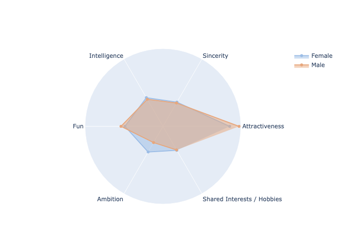
Conclusion: Both men and women think, that their competitors are looking for attractive partners — but there’s a drastically difference between women’s own ratings and their view on fellow female participants.
What participants think the opposite sex is looking for?
Finally, let’s find out how well the participants can empathize with the other gender.
1# What participants think the opposite sex is looking for?2cols = ['gender', 'attr2_1', 'sinc2_1', 'intel2_1', 'fun2_1', 'amb2_1', 'shar2_1']3query = df['wave'].between(1, 5, inclusive=True) | df['wave'].between(10, 21, inclusive=True)45participants_other_sex_looking_for = create_analysis(cols, query)6fig = create_spider_plot(df=participants_other_sex_looking_for)78fig.show()
Female participants have the impression, that men are most interested in women’s attractiveness. As an overall result, women almost accurately predicted what men are looking for in their potential partners. But: Men’s predictions were not far off either, although shared interests / hobbies was ranked a bit too low and attractiveness has a slightly higher score.
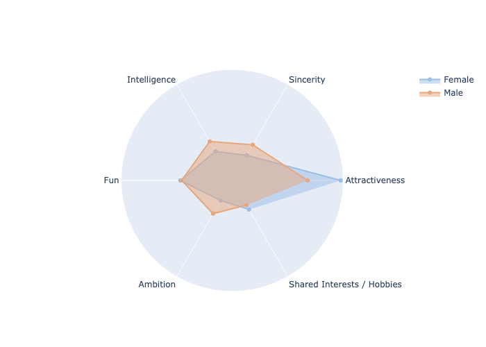
Conclusion: Both men and women can predict what the opposite sex is looking for in a potential partner (to a certain degree).
Primary Goal in Speed Dating Event
Knowing, what men and women are looking for in a potential date, let’s find out if the participants are seriously interested in finding a partner. Unfortunately, column goal is encoded as numbers, which makes it hard to interpret. Hence, I replace the values according to the manual and create a bar chart in a next step.
1# Replace numbers with strings for better readability2df.goal.replace([1, 2, 3, 4, 5, 6], ['Have Fun', 'Meet People',3 'Dates', 'Relationship', 'Say, I did it', 'Other'], inplace=True)45# Create data frame6cols = ['iid']7goals = df.groupby('goal', as_index=True)[cols].nunique()89# Create bar chart10cx = sns.barplot(data=goals.sort_values(['iid']).reset_index(),11 x='goal', y='iid', palette='pastel')1213cx.set_title('What is the primary goal in the Speed Dating events?')14cx.set_ylabel('participants')15cx.set_xlabel('goal')1617plt.show(cx)
Most of the participants have not the intention to end up in a relationship — thus, a speed dating event might not be the perfect place for singles to fall in love actually. More than half the people like to have fun and about 35% are interested in meeting other people. Roughly 4% of participants said, their primary goal is to get a relationship — which is 22 people in total.
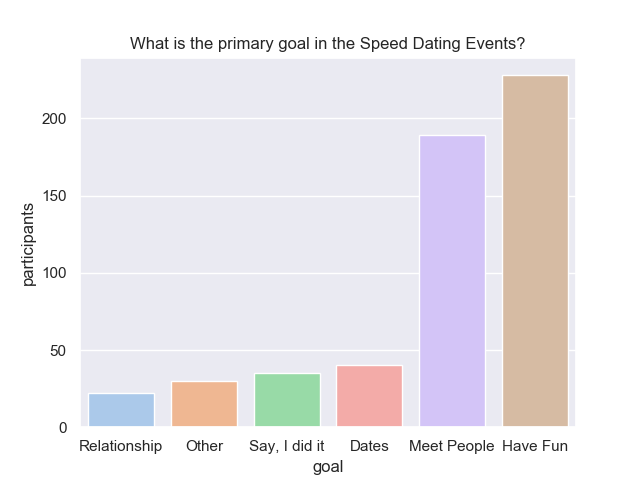
Although interest in relationships is ranked pretty low, let’s check how to get a second date.
A Second Date
Having the information, which attributes matter most, let’s find out which decisions taken by men and women result in a match. In this context, a decision tree is useful to visualize and represent “how to get to a certain decision”.
First, let’s filter the data frame to include women’s ratings on men. Further, it’s also necessary to care about missing values, because otherwise a ValueError might be thrown. Hence, I decide to interpolate the data to be able to continue. Finally, I assign a subset of the data frame with relevant feature columns to variable X and set Y to the target column to predict.
1def create_decision_tree():23 # Filter to include women's ratings on men4 df_men = df[df['gender'] == 'male']56 # Interpolate missing values7 df_men.interpolate(method='pad', inplace=True)89 # Feature columns10 feature_cols = ['attr_o', 'sinc_o', 'intel_o', 'fun_o', 'amb_o', 'shar_o'11 X = df_men[feature_cols]1213 # Target column14 Y = df_men.dec_o
In machine learning, a common task is to split data into a training and a test set. While the training set contains a known output that the model can learn on, a test set is used to test the model’s predictions on unknown data — in order to verify, whether the model is underfitting or overfitting.
The Python library sklearn ships with an implementation to split a data frame and a target column into training and test sets. So, I make use of the function train_test_split and choose 70% of the data for training and the remaining 30% for testing.
1from sklearn.model_selection import train_test_split23 # Split into training (70%) and test (30%)4 X_train, X_test, Y_train, Y_test = train_test_split(X, Y, test_size=0.3)
A decision tree is created also rather simple, when using a DecisionTreeClassifier. Parameter max_depth defines the maximum depth of the tree, which equals to the number of conditions to incorporate until a decision is made. Note: High numbers may result in overfitting the model. Using a maximum depth of 2 results in an accuracy of 73%. But: Feel free to play around with the parameter.
1from sklearn.tree import DecisionTreeClassifier2from sklearn import metrics34 # Create Decision Tree5 clf = DecisionTreeClassifier(max_depth=2)6 clf = clf.fit(X_train, Y_train)7 Y_pred = clf.predict(X_test)89 print("Accuracy: ", metrics.accuracy_score(Y_test, Y_pred))
Finally, it’s time to export the decision tree as an image.
1from sklearn import tree2import pydotplus34 # Use GraphViz to create an image5 dot_data = tree.export_graphviz(clf, out_file=None,6 feature_names=feature_cols,7 # 0 = No Match, 1 = Match8 class_names=['0', '1'],9 filled=True, rounded=True)1011 # Export image to file12 graph = pydotplus.graph_from_dot_data(dot_data)13 graph.write_png("decision_tree.png")
The first line of a tree’s square is a condition, e.g.
which equals to either true or false. Samples in line tree refer to the total number of rows in the data frame at the beginning of a condition, whereas values in line four indicate, how many of them are true and false.
In case you’re wondering, why the number of samples is 2935 — it’s the number of dates and not the number of participants. Using samples’ values of both trees, each participant has about 10 dates during the speed dating events, as:
Now, let’s have a look at the decision trees for men and women.
How do men get a second date?
Having an attractiveness score higher than 6.75 and if further shared interests / hobbies is ranked above 4.5, men have a chance of 36.25% of meeting the opposite again. Otherwise, it’s impossible to get a second date, as this is the only path that ends up in a match.
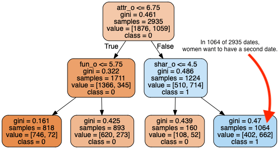
Interesting to note is that the decision tree does not conform with the statement of women, that they were looking for a well balanced men. However, comparing with what women think their competitors are looking for, there’s a match. One might assume that women don’t want to admit that they judge mainly by attractiveness?
How do women get a second date?
Having a look at the path that yields a second date, then it’s close to women’s decisions. Only difference is, that the attractiveness score is split at 6.25 — which is 0.5 points lower. This is also the reason, why the chance for women of meeting the opposite again is at 43.95%.
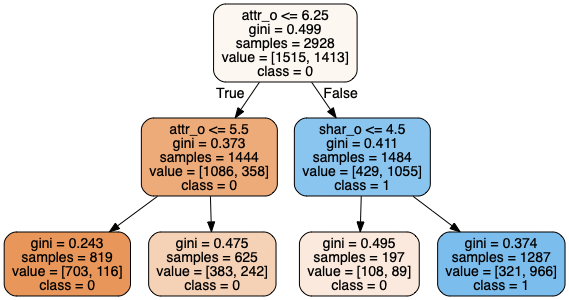
Interesting to note ist that the decision tree does conform with the statement of men, that they were looking for an attractive women. Further, one might assume that men are not as picky as women?
PS: The decision tree can be created by changing the filter at the beginning of the function, to include men’s ratings on women.
Lessons Learned
There’s definitely more interesting analysis and insights that can be extracted from the dataset — that’s why I would like to add more content to this article in the future.
But: While analyzing the dataset, I learned that:
- Men and women can predict, what the opposite sex is looking for
- Most participants in speed dating events are not interested in finding a partner
- Attractiveness is the most relevant attribute in a potential date
If you want to start working on an analysis, too, but don’t have an idea where to go from here: Have a look at other people’s notebooks to get inspired. ▪